

Brand Identity – DIFFRNT
DIFFRNT is more than just a clothing label; it’s a cultural stance. Born from the need to break away from expectations and uniformity, DIFFRNT is a streetwear brand that empowers self-expression through bold, fearless design. It speaks to a generation that doesn’t want to fit in, but stand out as creatives, rebels, outsiders, and innovators who view fashion as a canvas for identity.
Rooted in urban culture and inspired by underground movements, art, music, and skatewear, DIFFRNT turns rejection of the norm into a personal style manifesto. The brand thrives on contradiction, clean lines meet warped forms, symmetry is challenged, and familiar fonts are twisted into something entirely unexpected. Every design choice reflects a refusal to conform.
From the name itself to its evolving visual language, DIFFRNT challenges the idea of “what’s right” in design, fashion, and branding. It’s for those who proudly take the road less traveled, carving their path, even if it means going against the grain.
DIFFRNT is not just what you wear, it’s how you live.
EXPLORING LOGO CONCEPTS
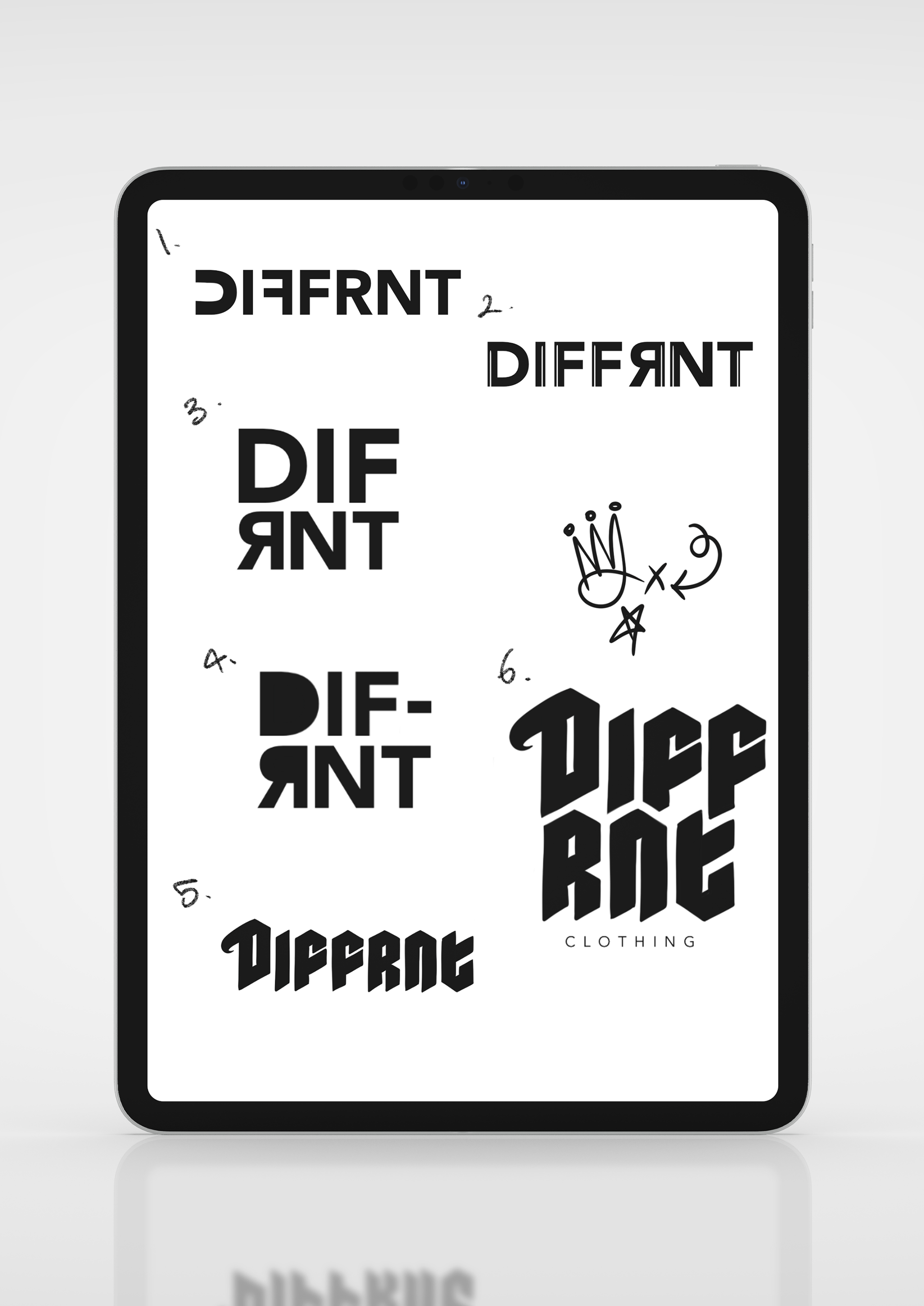
These initial logo explorations experiment with the visual identity of DIFFRNT, emphasizing uniqueness through shape, spacing, and typographic innovation:
Concept 1 features a clean, minimalist sans-serif with a mirrored “E” effect in the “F” and “R” combination, hinting at subtle disruption within a clean design.
Concept 2 adds texture and flair with vertical lines running through the letters, giving it a modern, edgy feel that aligns with streetwear’s bold aesthetic.
Concept 3 breaks symmetry by flipping the “R,” creating an unexpected visual rhythm that immediately catches the eye, communicating rebellion and creativity.
Concept 4 separates “DIF” and “RNT” with a bold dash and exaggerated curves, emphasizing division and difference as the brand’s strength.
Concept 5 uses gothic, angular lettering to channel vintage hardcore and punk energy, perfect for a gritty, underground style.
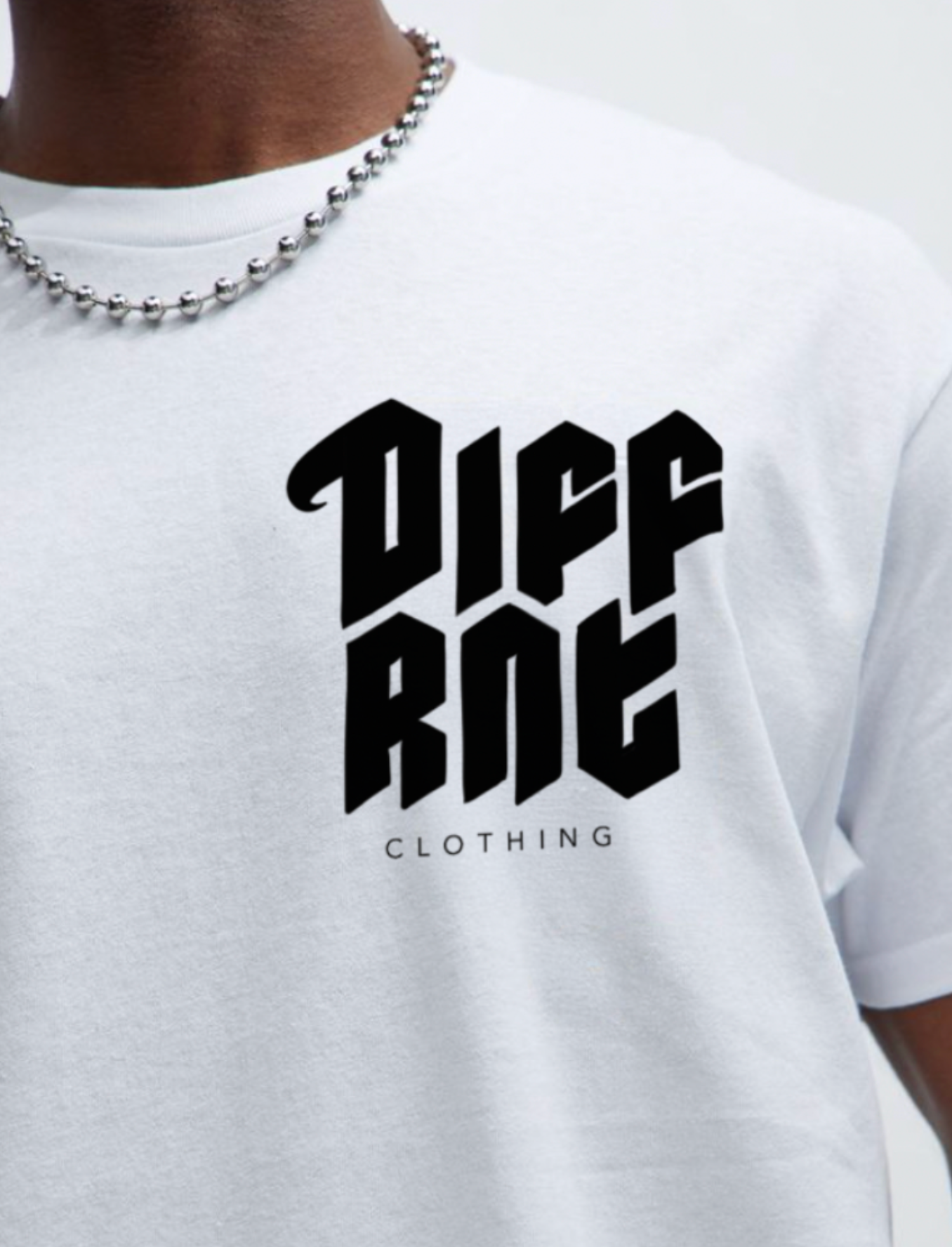
Concept 6 turns the name into a stacked, almost emblem-like block of sharp, stylized lettering, supported by a clean “CLOTHING” label beneath, an ideal choice for branding and apparel applications.
Together, these sketches showcase a dynamic range of directions for DIFFRNT, from minimalist and modern to raw and rebellious, each one echoing the core message: dare to be different.