

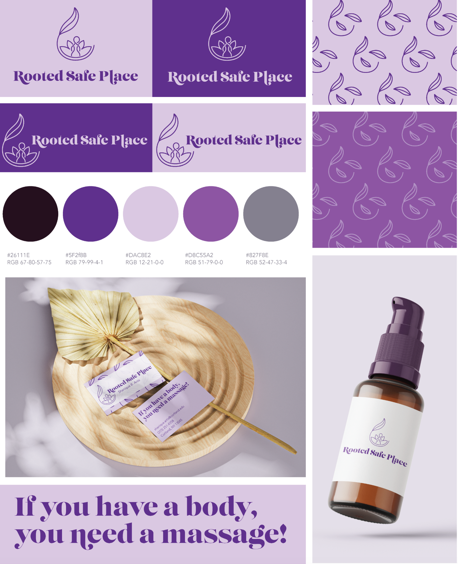
Brand Identity – Rooted Safe Place
Rooted Safe Place is a wellness brand that centers healing, comfort, and embodiment through therapeutic touch. Its brand identity exudes a sense of calm, empowerment, and gentle strength, aligned with its mission to create a nurturing space for massage and self-care. The logo features a stylized, organic motif that subtly resembles a figure grounded within leaves, symbolizing growth, safety, and rootedness.
The color palette is a harmonious blend of deep purples, soft lavenders, and grounded grays, evoking tranquility, introspection, and warmth.
The brand typography is bold yet elegant, with soft serifs echoing the curves of the logo, balancing professionalism with personality, and adding a human touch to the visual identity.
Reinforcing the brand’s approachable tone is the tagline: "If you have a body, you need a massage!", a friendly, inclusive invitation that breaks down barriers and reminds everyone self-care is essential, not indulgent.
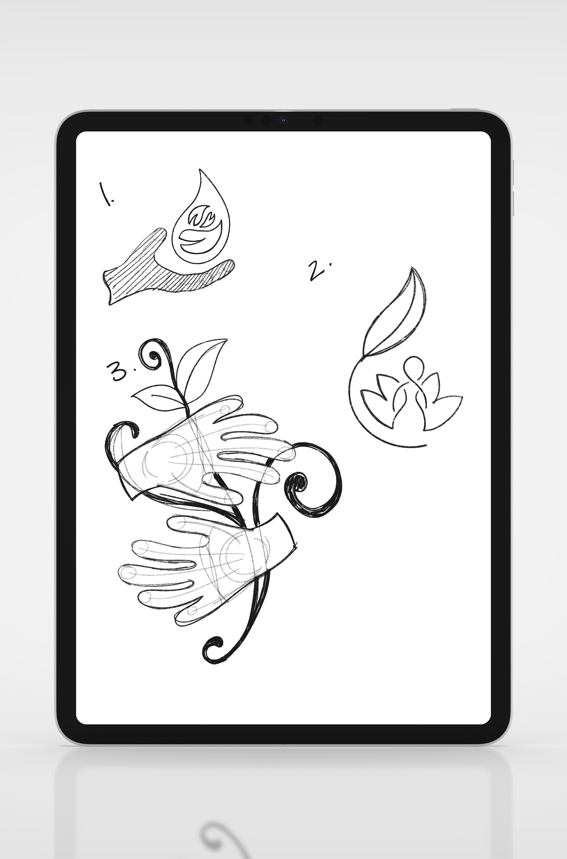
Exploring Logo Concepts
These early logo sketches represent a thoughtful exploration of symbolism, form, and emotion for the Rooted Safe Place brand. Each concept reflects a unique interpretation of the brand’s core values: healing, grounding, growth, and human connection.
Hand + Drop Motif
This design combines a nurturing hand with a droplet-like shape, suggesting healing touch, natural elements, and emotional safety. Within the drop, an abstract leaf and wave motif hint at both growth and fluidity, key to the massage and wellness experience.
This design combines a nurturing hand with a droplet-like shape, suggesting healing touch, natural elements, and emotional safety. Within the drop, an abstract leaf and wave motif hint at both growth and fluidity, key to the massage and wellness experience.
Rooted Embrace Icon
A refined, minimalist emblem featuring a human figure set among leaf-like forms. This concept is soft and symbolic, visually evoking protection, balance, and the idea of being “held” or supported. The upward curve of the leaf reinforces growth and upward movement.
A refined, minimalist emblem featuring a human figure set among leaf-like forms. This concept is soft and symbolic, visually evoking protection, balance, and the idea of being “held” or supported. The upward curve of the leaf reinforces growth and upward movement.
Hands + Vines Sketch
This more illustrative option places focus on hands intertwined with organic vines, creating a strong narrative of care, connection, and nature. It speaks to the idea of healing through touch and being deeply rooted, both physically and emotionally.
This more illustrative option places focus on hands intertwined with organic vines, creating a strong narrative of care, connection, and nature. It speaks to the idea of healing through touch and being deeply rooted, both physically and emotionally.